Designing decision infrastructure in high-risk payments.
Founding designer building a cross-product design system, refactoring high-trust workflows, and shipping a fast feedback-to-release loop across two payment products.
- Role
- Founding Designer + PM
- Scope
- Design System · Risk-aware UX · End-to-End Ownership
- Tools
- Figma · Figma Make · AI-assisted workflow
- Timeline
- Jul 2025 – Present
Overview
One founding designer, two live products: patch what's breaking, rebuild what won't scale.
Onboarding rebuild
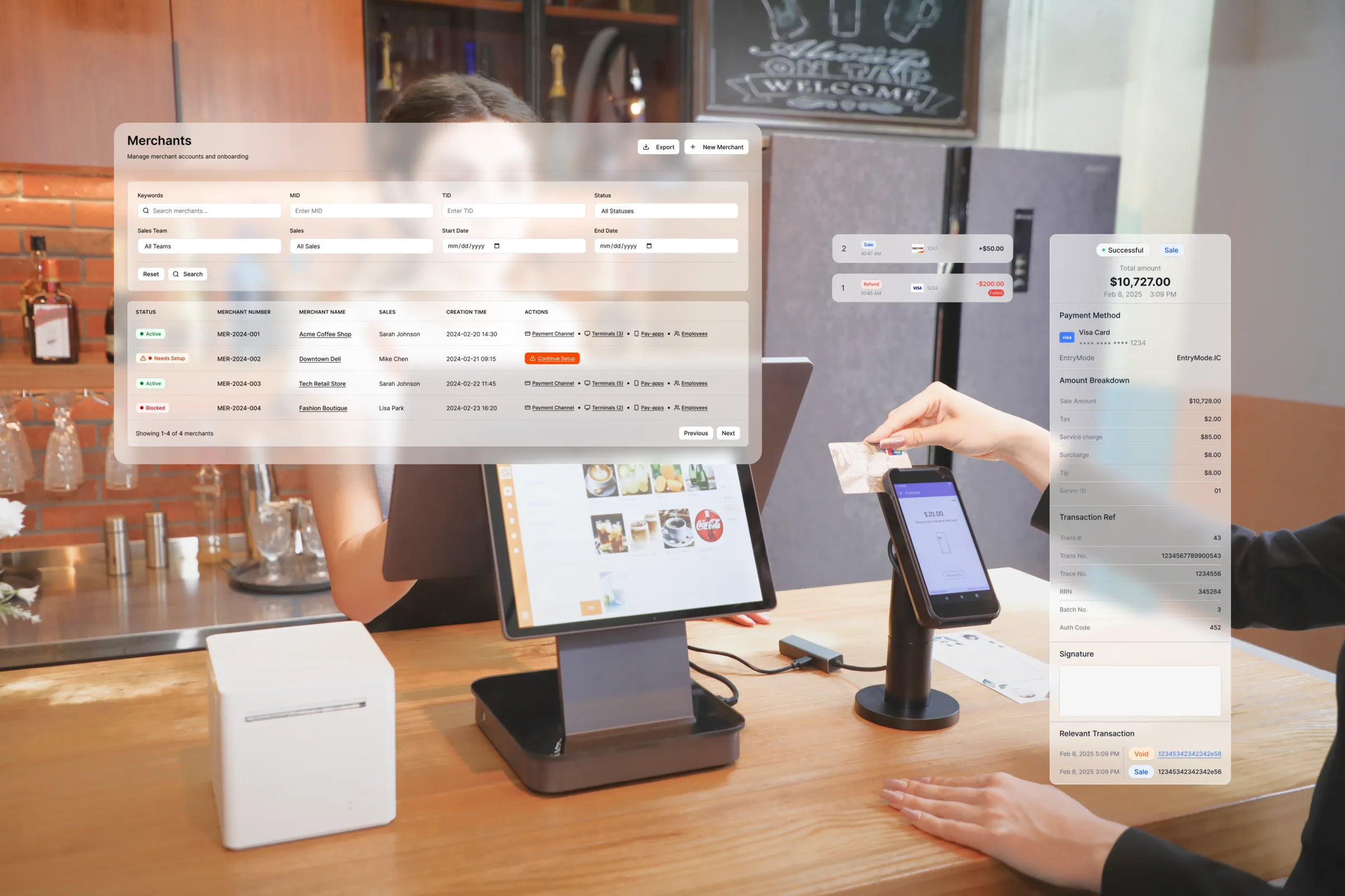
IA & UXThe platform partners use to bring a new merchant onto payment solutions. I restructured the onboarding workflow to strip friction out of a complex setup, cutting effort for the merchant and ops cost for us.
~30%
less setup effort


Payment app rebuild
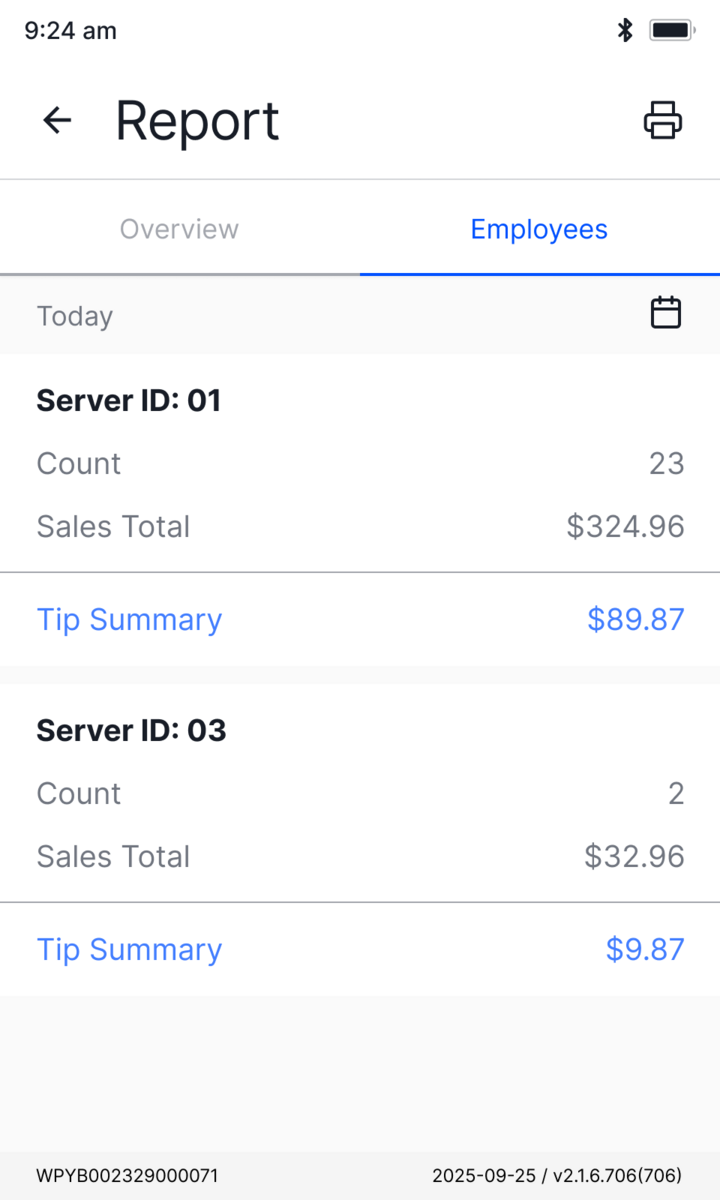
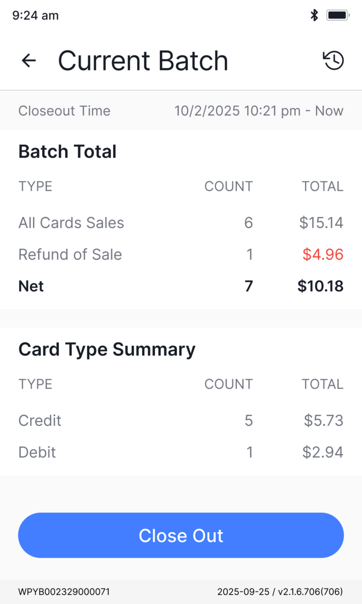
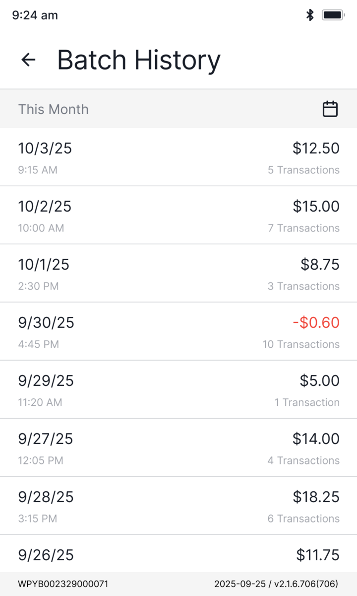
UI/UXThe app staff run every sale on. I rebuilt the payment workflow and its UX on one shared component system, so the busiest moment at the counter stays fast and clear across 100+ screens.
~2,000
terminals on the new UI
Challenge → Strategy
The flexibility we sell, and the complexity it creates.
The complexity we can't design away
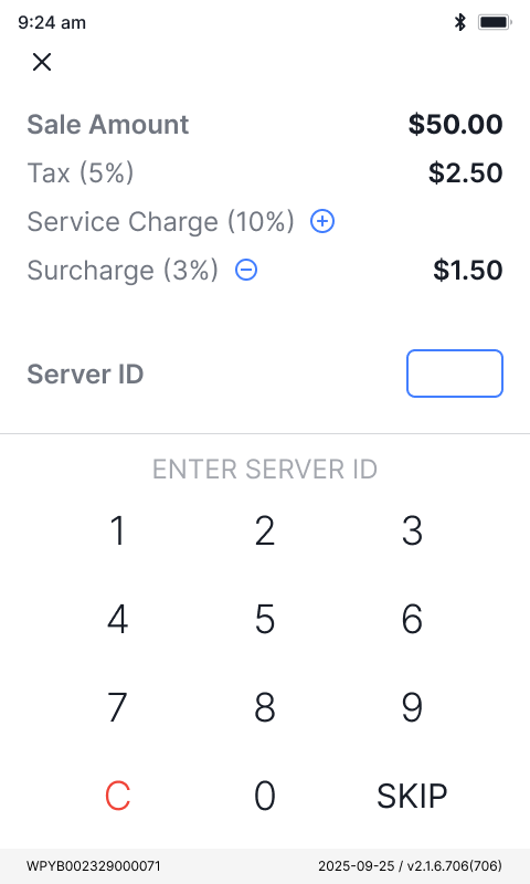
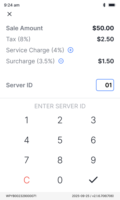
Flexibility is the whole pitch: one app for a coffee cart, a busy bar, a furniture showroom. But every choice a merchant gets at the counter is a setting someone configured in the back office, so the flexibility we sell and the complexity it costs are two sides of one coin. The work was never to delete that complexity, only to absorb it, so each step stays legible and hard to get wrong.
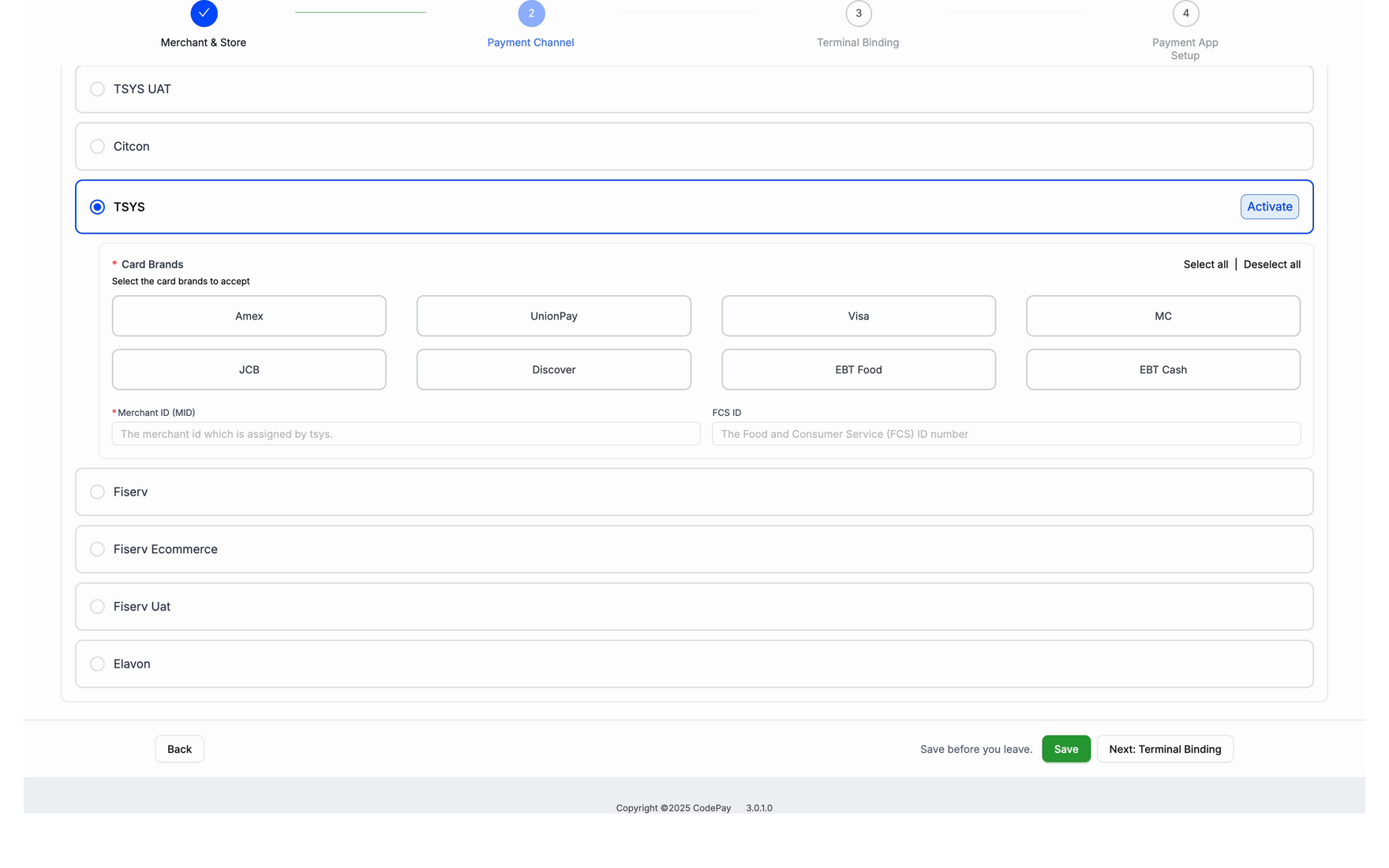
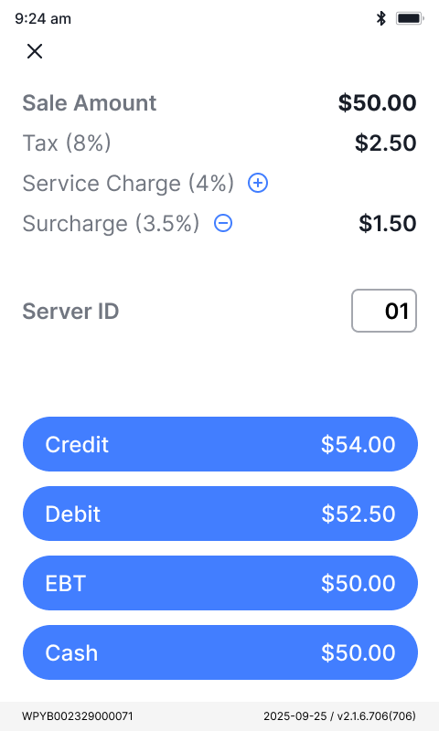
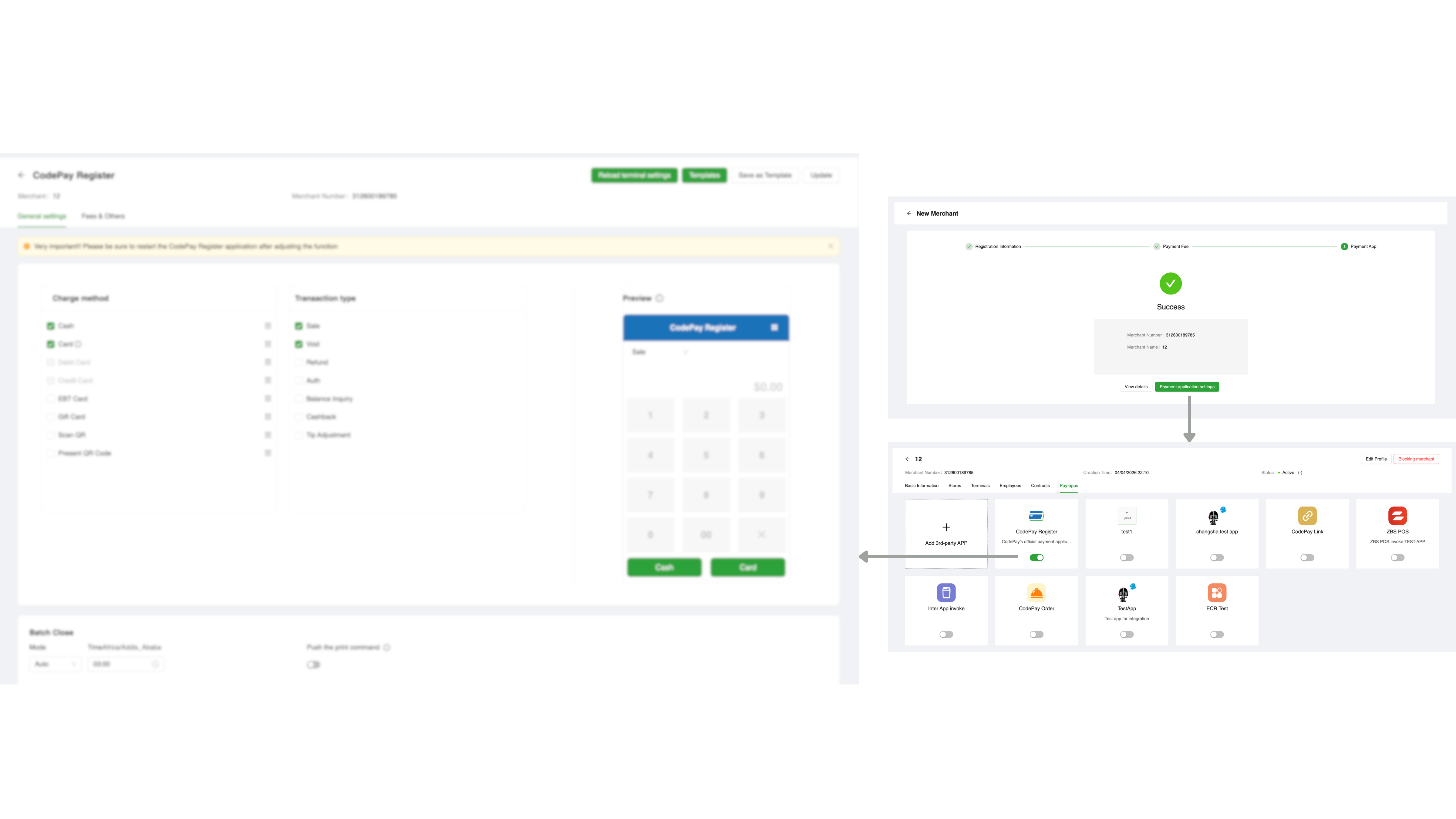
Select which payment methods are enabled for this register
Enabled Payment Methods
Payment methods. Each way to pay is a checkbox in back — only the ones turned on become buttons on this screen.
Three pressures, three tracks
The same trade showed up on my side of the desk: one designer, two products already live, and a backlog split between what was breaking today and what wouldn't scale tomorrow. I read it as three pressures and gave each its own track.
In payments, one wrong tap moves real money, and real trust.
Rank every fix by the damage it prevents, and add guardrails and second-checks to the most dangerous steps first.
Two products had drifted apart: the same idea, built a little differently on every screen.
Rebuild one shared design system, then move both products onto it gradually so nothing live has to break.
One designer against two live products, speed was the real limit.
Fast clickable prototypes and AI-assisted iteration to align the team, test with real merchants, and ship in tight loops.
Patch Track
I turned noisy requests into high-leverage fixes with guardrails and consistent state patterns.
03Out as small, shipped fixesonto both products, in fast iterations
Four design principles
Far too many to show, so the four below are the throughline, each one a representative fix.
#Make system state always visible
Showing the right state at the right moment is the cheapest form of error prevention.
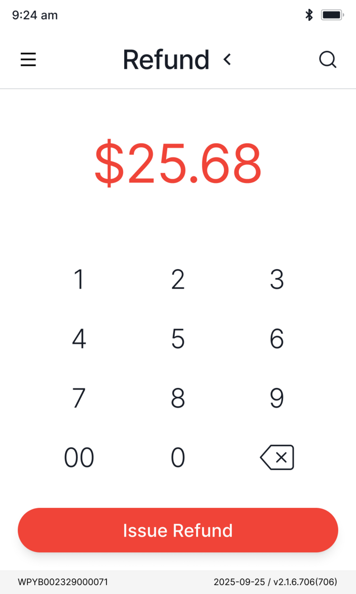
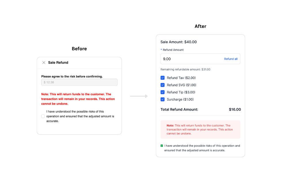
## Problem
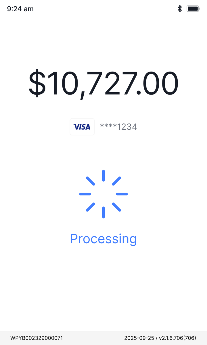
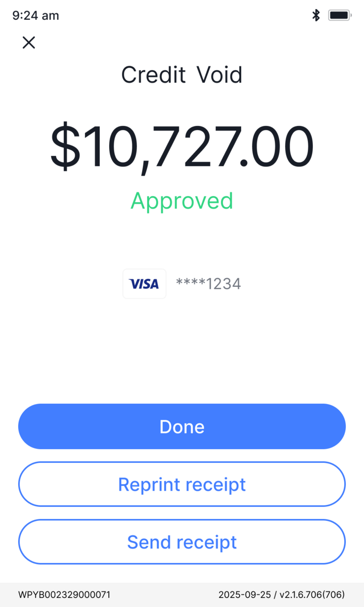
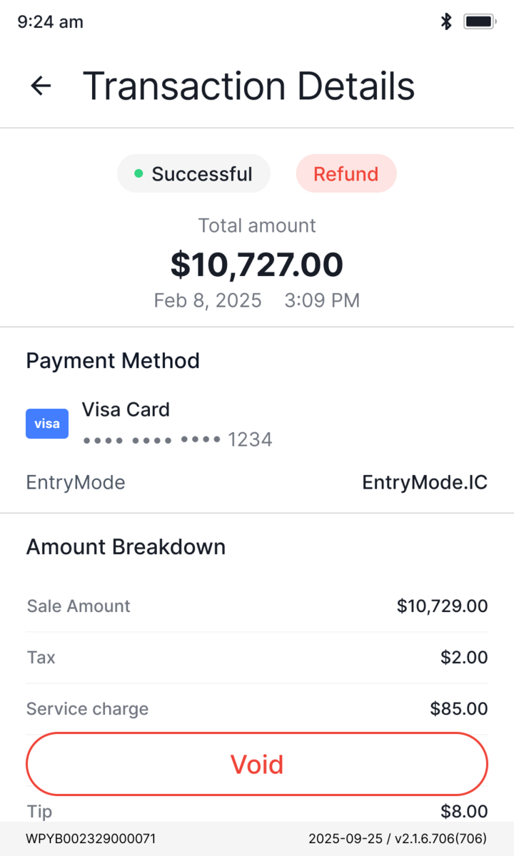
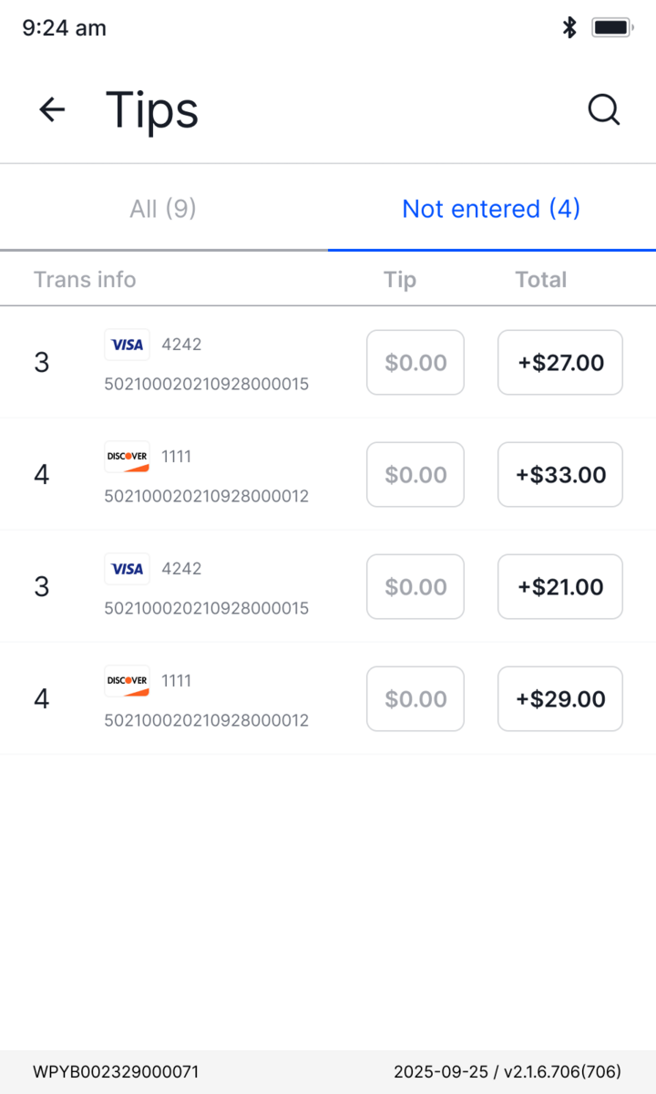
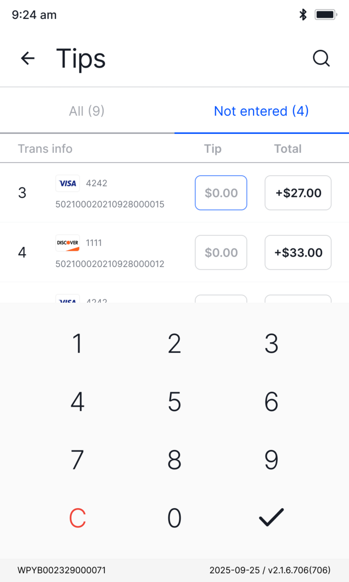
The system only supported full refunds. Adding partial refunds meant staff had to decide with no feedback on what they'd selected or how much was left.
## Decision
The refund screen now updates live as selections change: remaining refundable amount, per-item breakdown, and running total all reflect the current state instantly.
Platform Track
Rebuild the foundation once, then rebuild both products on top of it.
Patches bought time. The platform track is the rebuild for tomorrow: one shared foundation, then the two products on top of it. The payment app on the counter, and the partner platform behind it.
Design system
Build the thing that makes design scalable, before designing anything.
A cross-product foundation on an open-source base, reskinned with brand tokens. One source of truth for color, type, and spacing across every product.
Color
Typography
Inter · one family
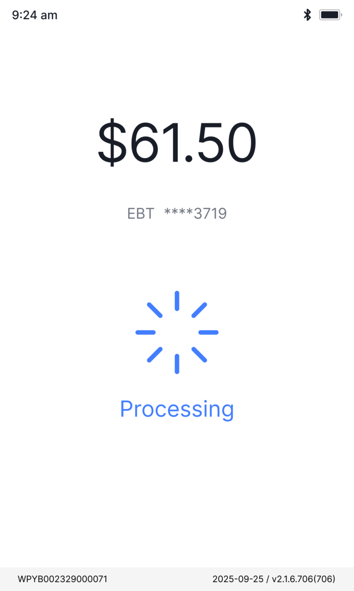
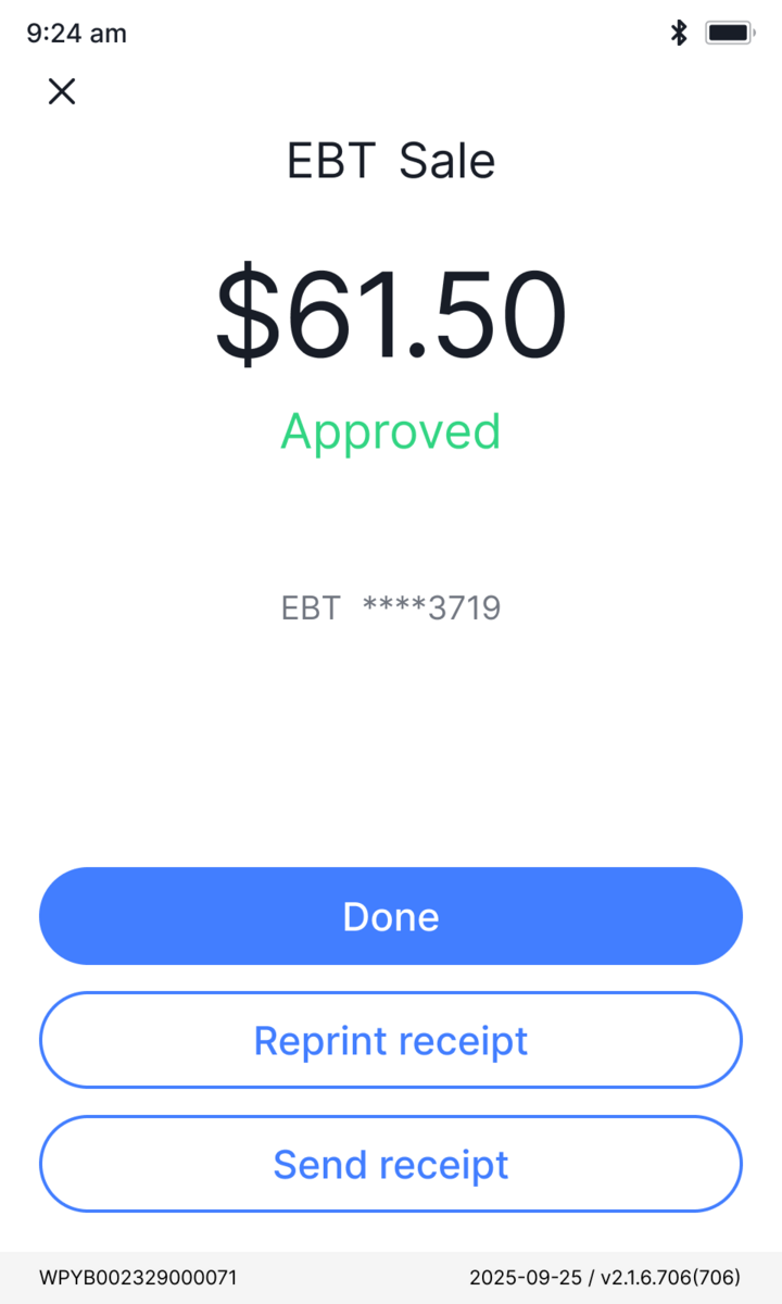
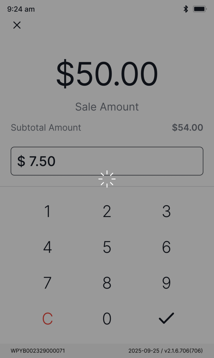
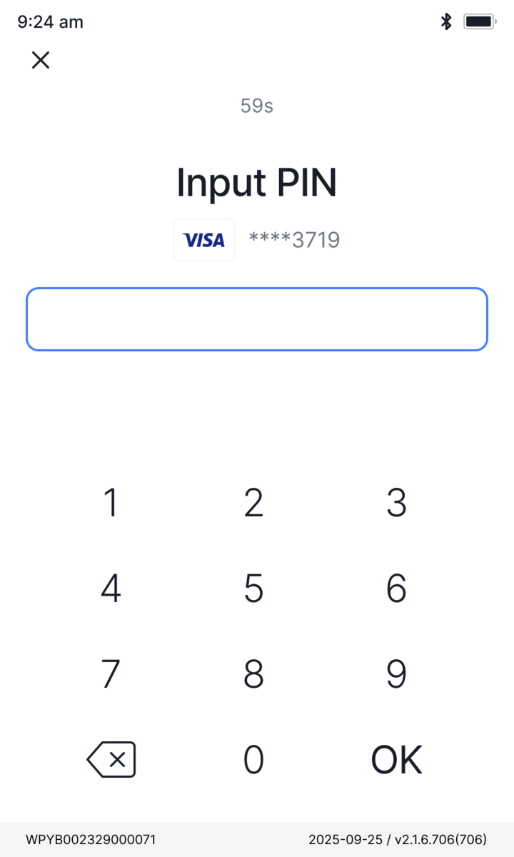
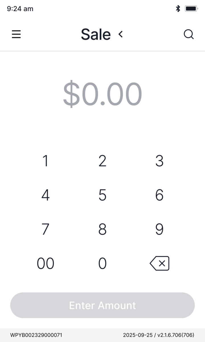
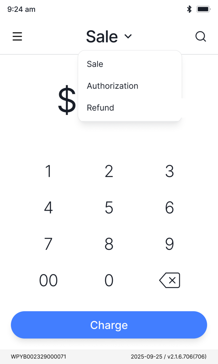
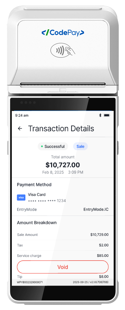
Payment app
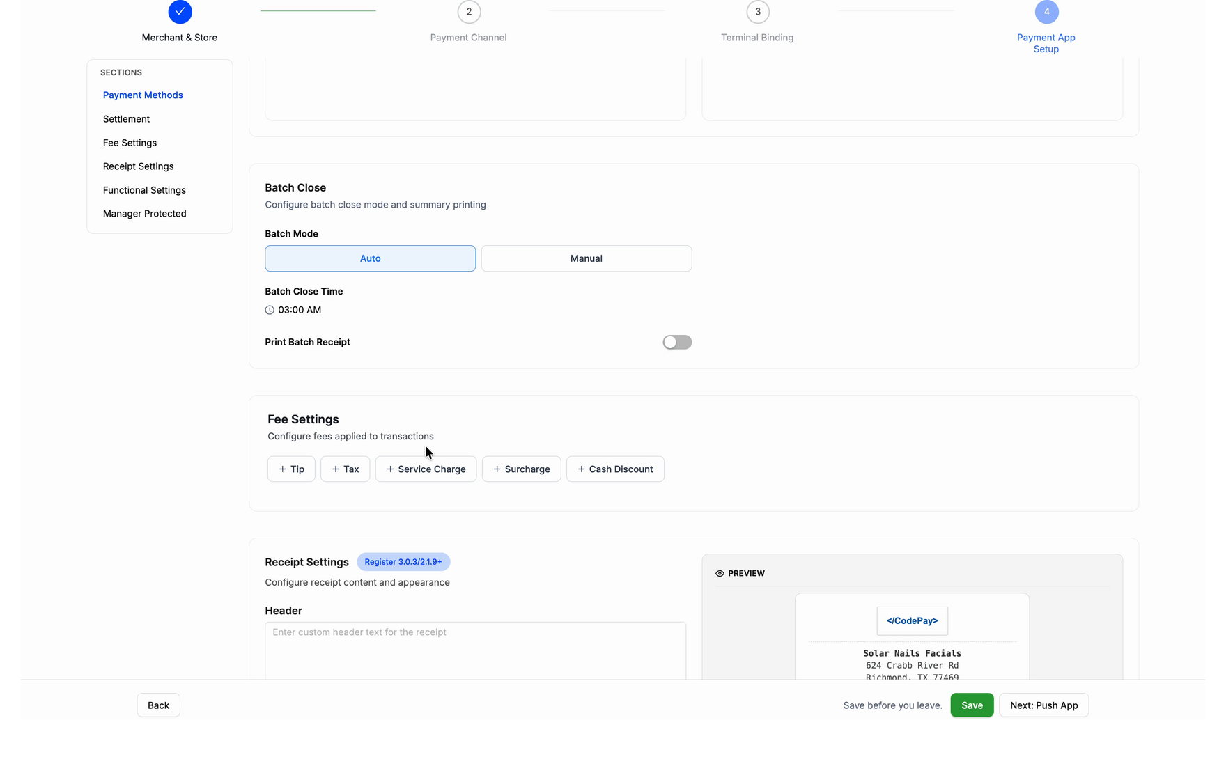
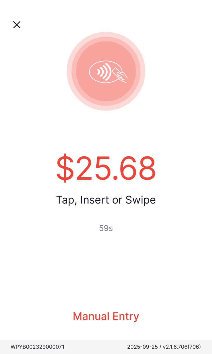
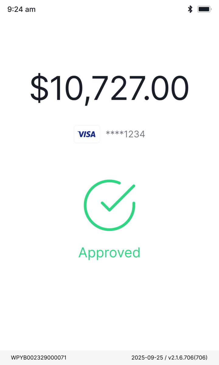
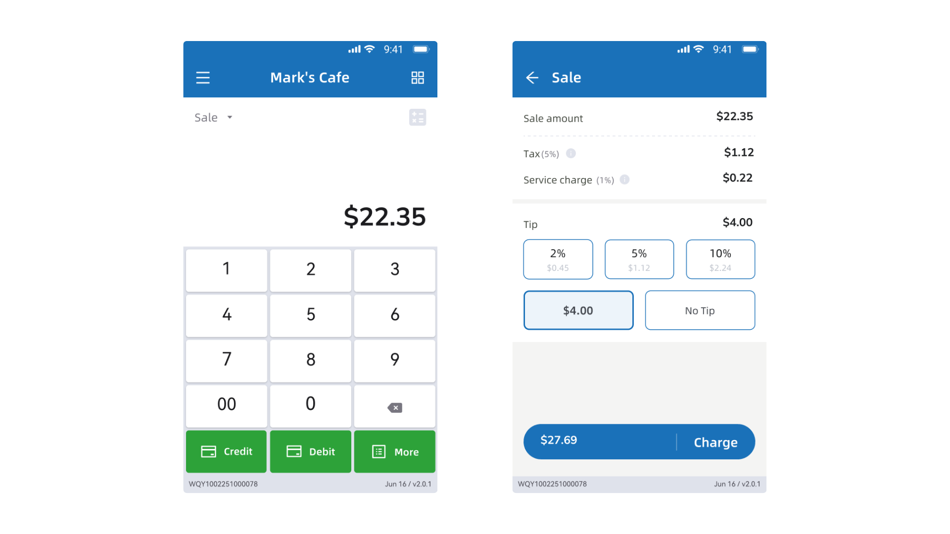
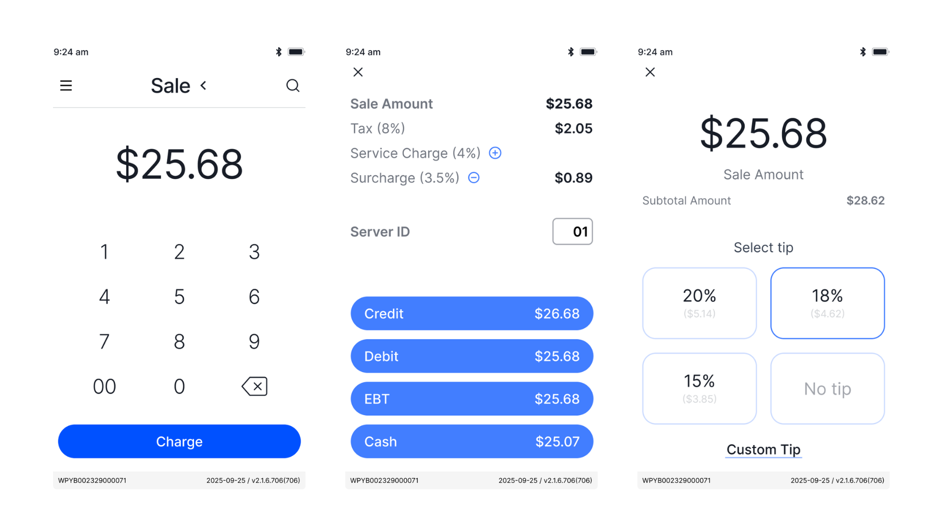
UI/UX rebuildFast enough for a rushed cashier, learnable without training, consistent enough to scale.
v3.0 UI/UX rebuild, as design lead with the PM. Transaction and payment logic could not change, so the tools were clarity, hierarchy, and sequence.
Active terminals
Weekly transactions

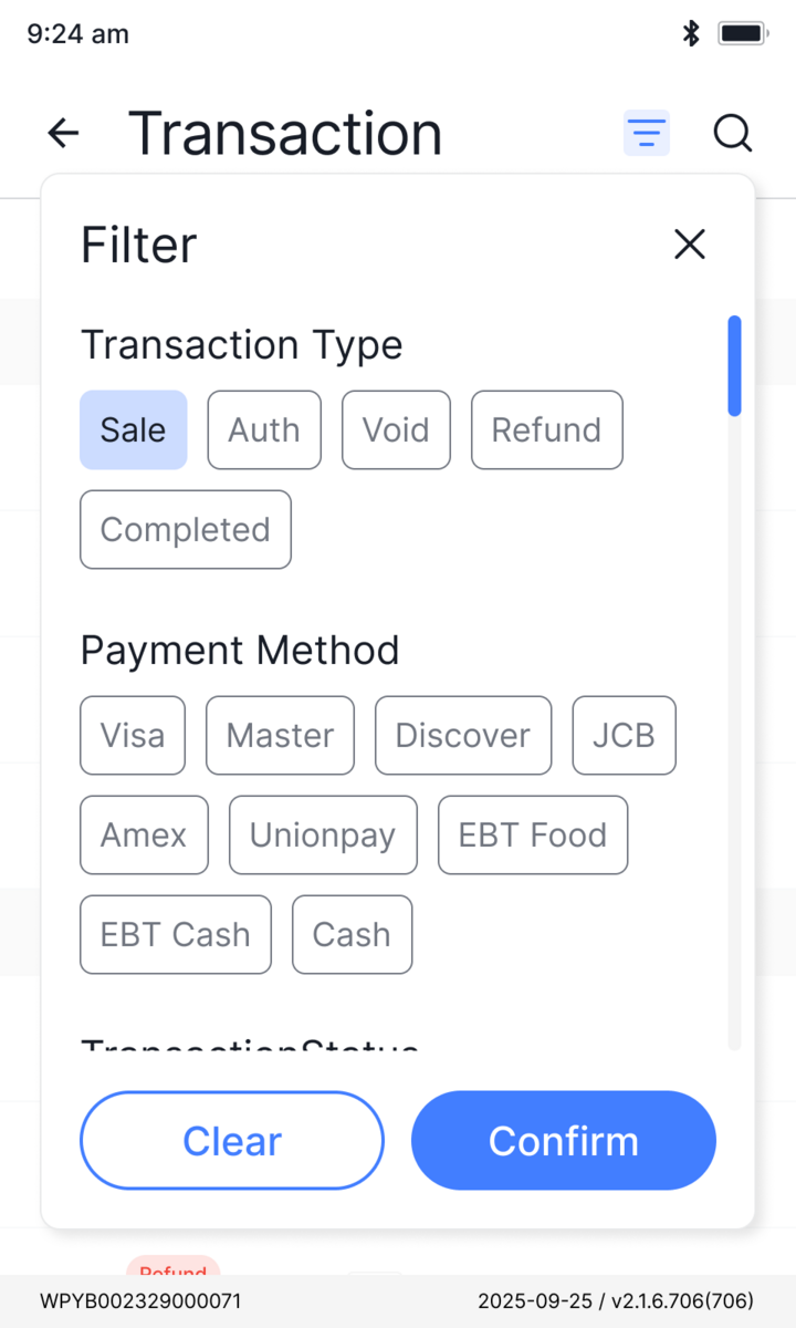
The component system
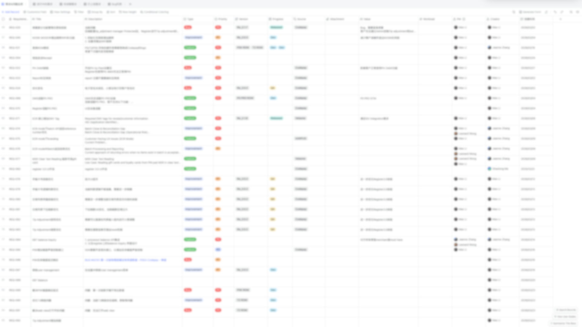
An app-specific library on top of the design system. Every fix goes back into the component, not the screen, which kept 100+ screens consistent under constant iteration.
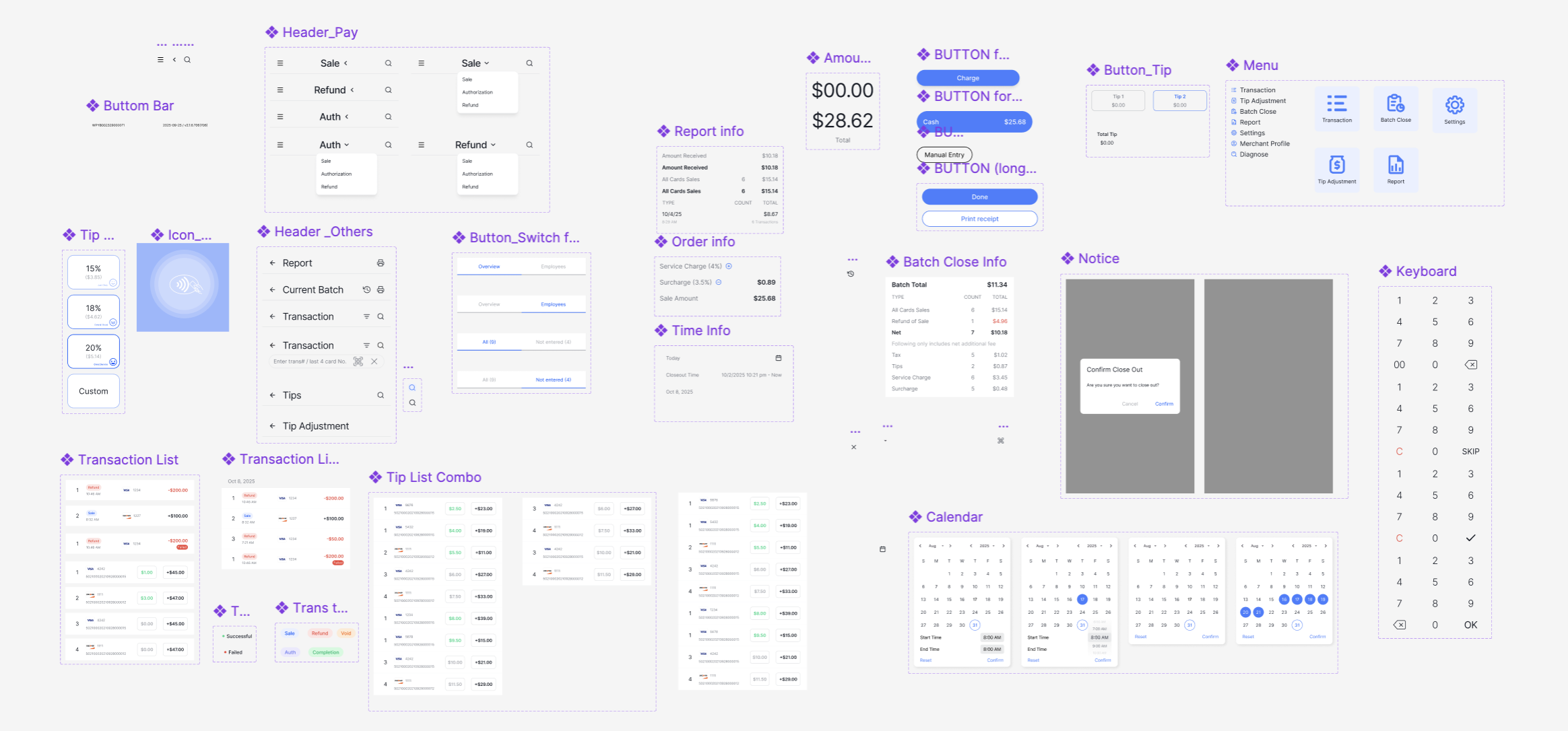
Same components, same rules, grouped by flow.
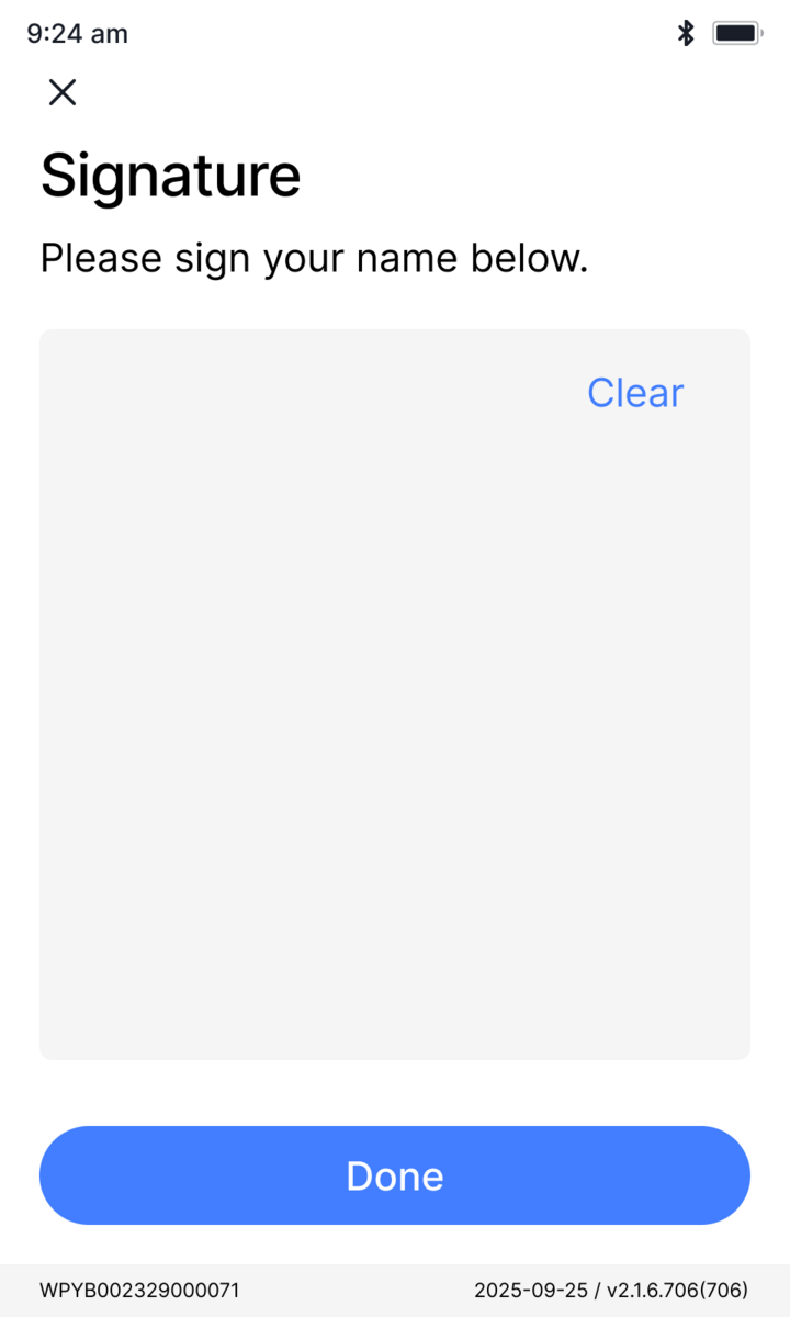
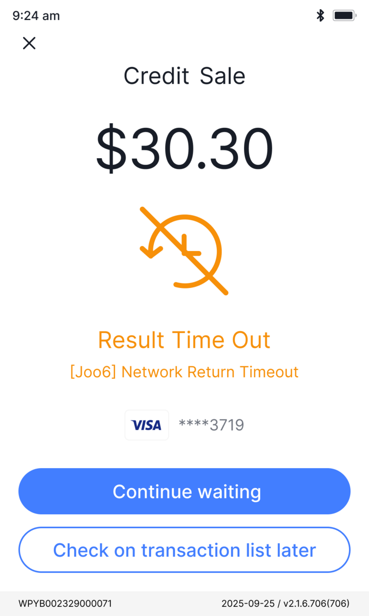
Designed for the unhappy pathState VisibilityReversibility
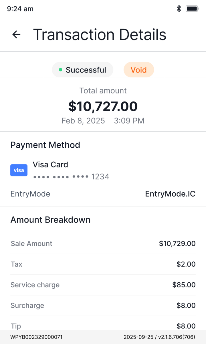
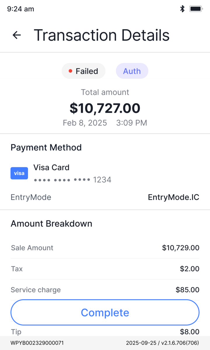
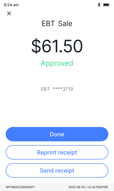
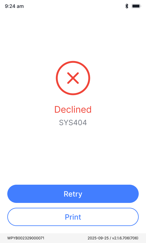
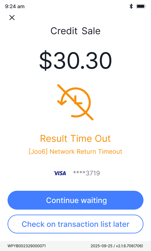
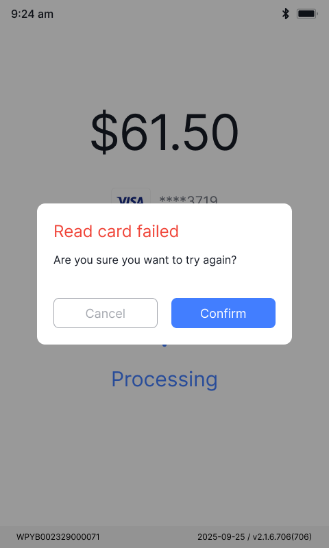
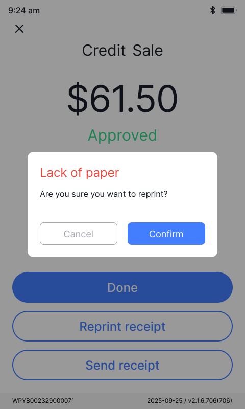
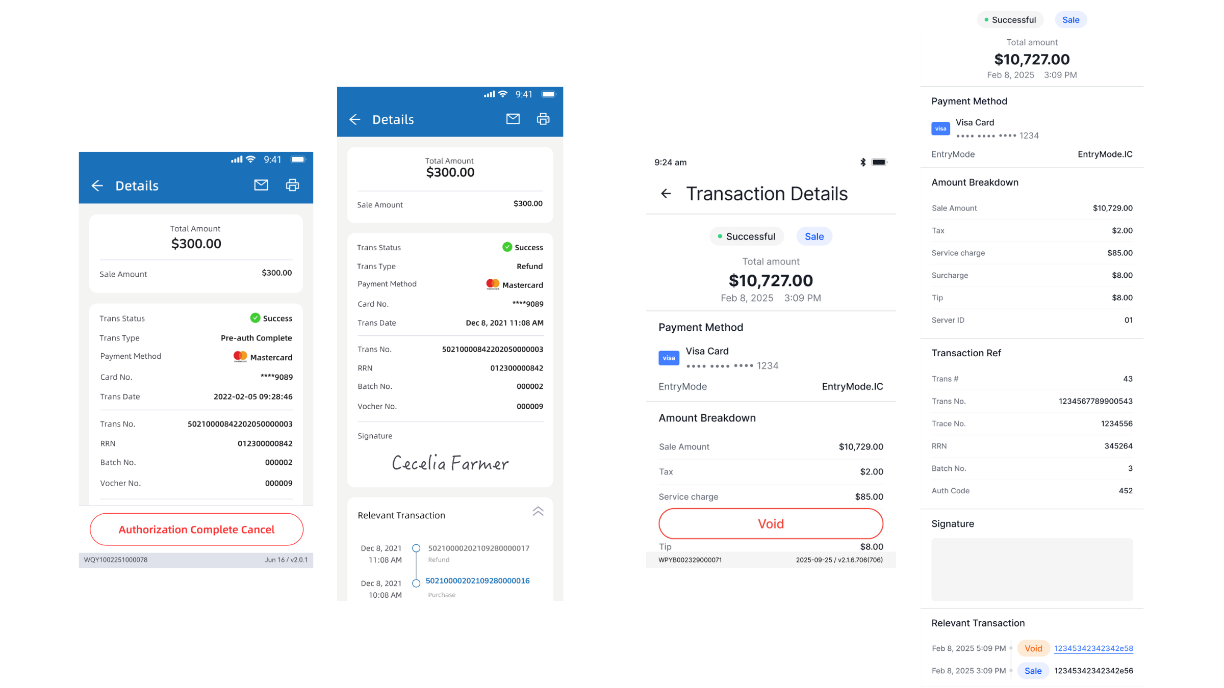
In payments, the unhappy path is the product. Every hard state lives in the shared component, not the screen, so each one stays explicit and recoverable.
Declined, timeout, read failure, out of paper: a clear state and a way forward, never a dead end.
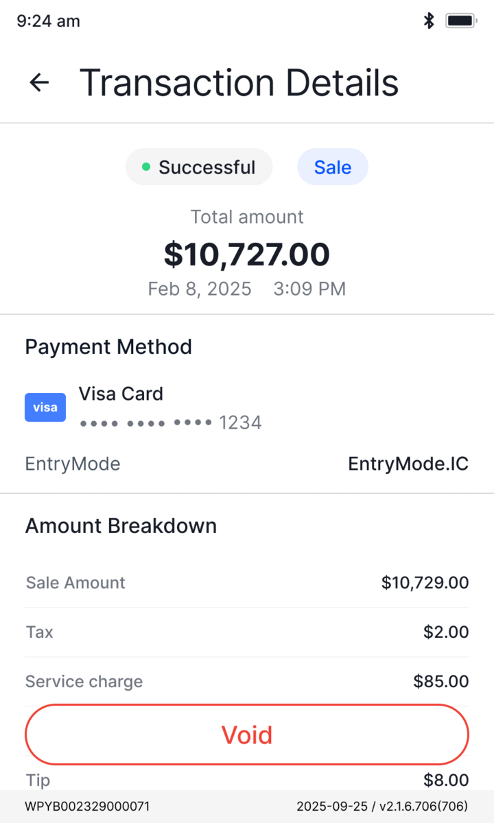
Same flow, before and after
Two decisions shaped the rebuild. The same tasks at the counter, redrawn so each one is harder to get wrong.
Split one screen into twoCognitive Load
The fix was separation of concerns, not simplification.
Let state drive the interfaceState Visibility
The result should read before anyone acts.
Post-launch
~2,000
Terminals on the new v3.0 UI/UX
Feedback pointed the same way: streamlined staff workflows, and fewer errors at the counter.
Operations platform
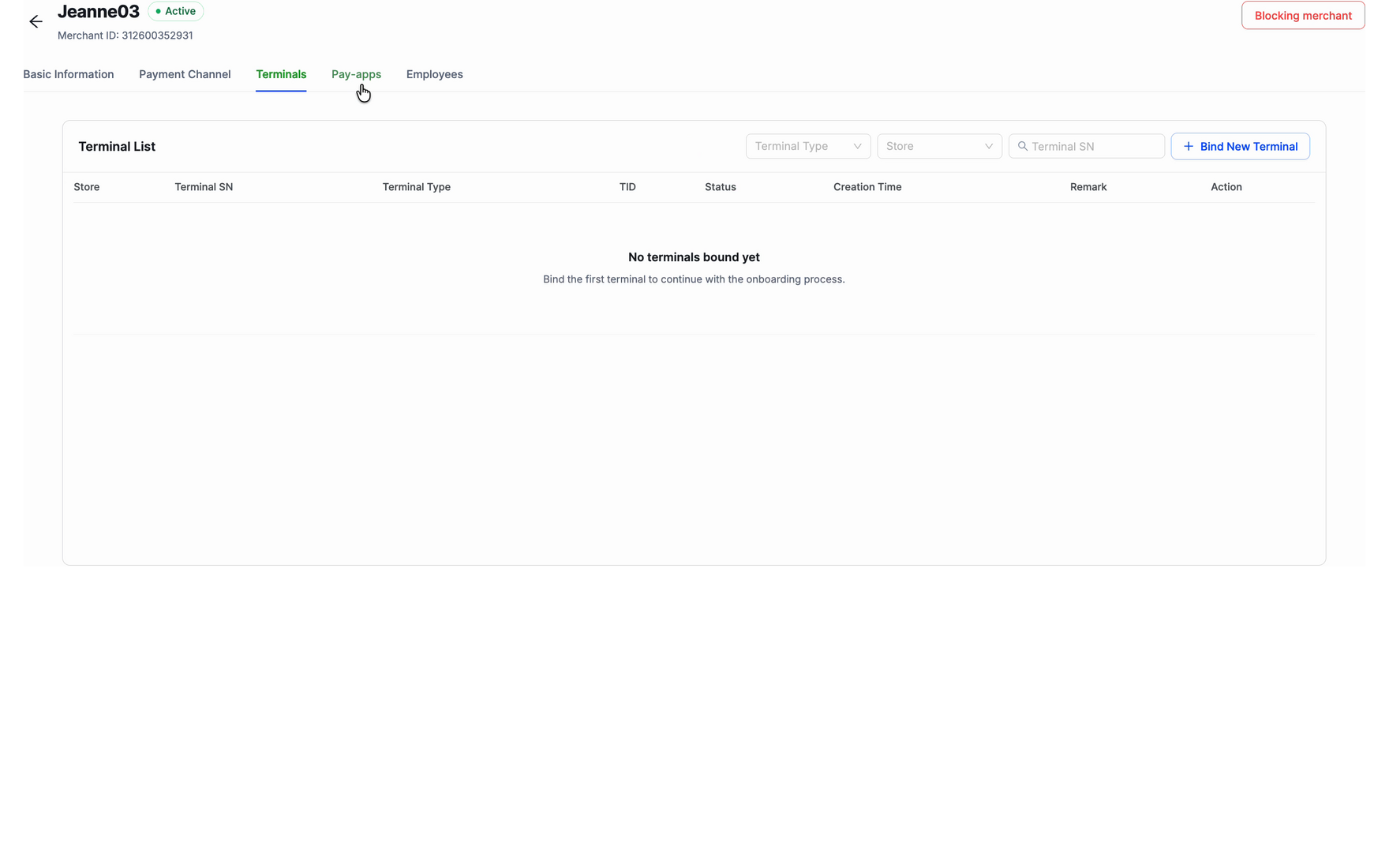
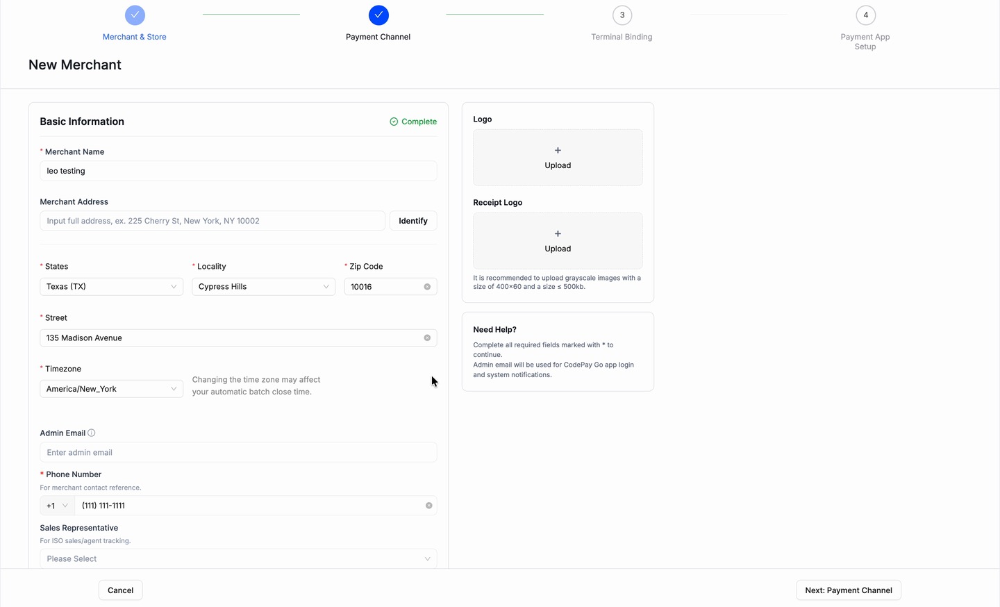
IA & UX rebuildA rebuild of the merchant onboarding flow. The platform created and managed merchants in one place, so I split the two jobs.
An information-architecture rework, not a UI redesign. The screens reuse the existing components on purpose. What changed is structure and hierarchy, which is where it broke.
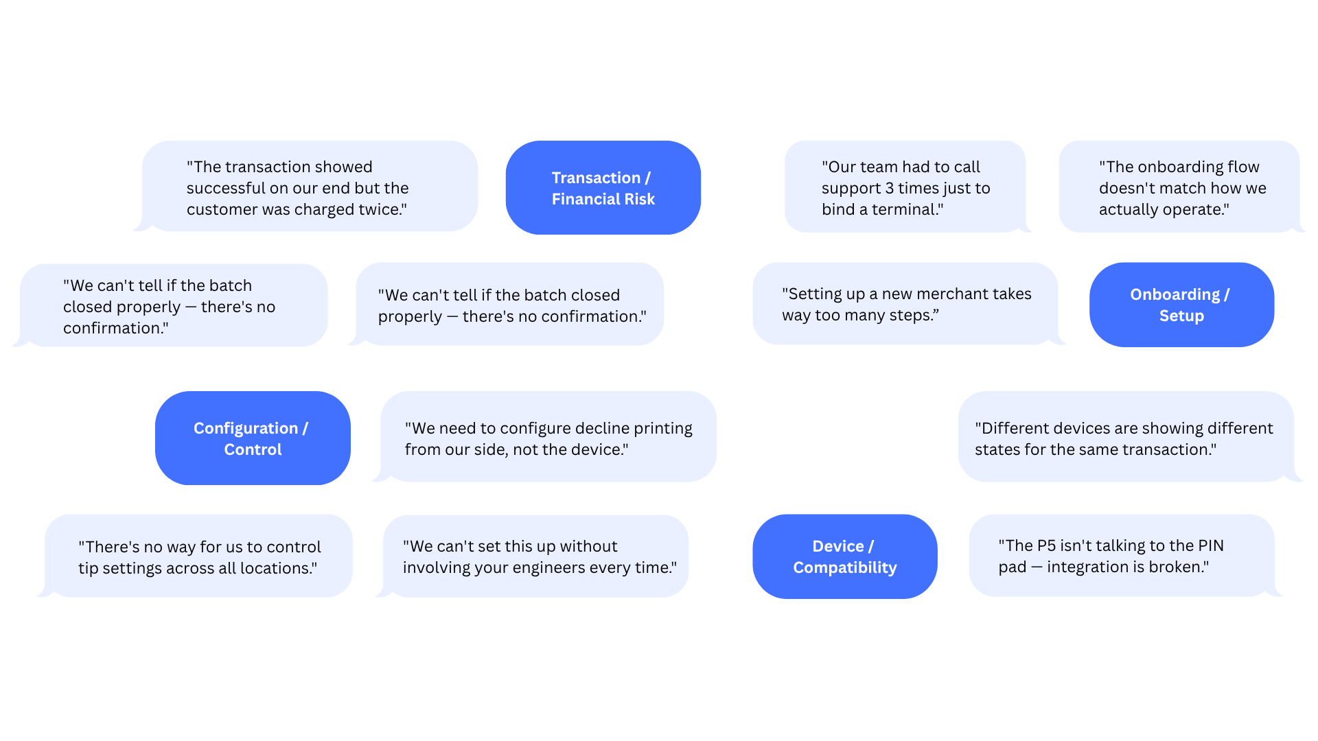
Partners and ops kept describing the same root cause.
Nobody could use it without training. The onboarding workflow was complex enough that partners leaned on our ops team to finish it, instead of completing it on their own.
Discovery · partner + ops interviews
Too much, all at once
What do I actually need?
Did it actually work?
Onboarding wore management's clothes
A first-timer saw every tool at once.
No line between required and optional
Nothing marked what you needed to go live.
No signal you were done
A setup could look finished while it wasn't.
Too tangled for a doc to settle, so I prototyped the structure with AI.
Figma Make turned the IA into clickable frames, one fix per problem, so the team argued with the real flow instead of a spec.
2 days
to a clickable prototype in front of the team
100+
versions iterated before export
Workable flow
to align the team on the real thing, not a doc
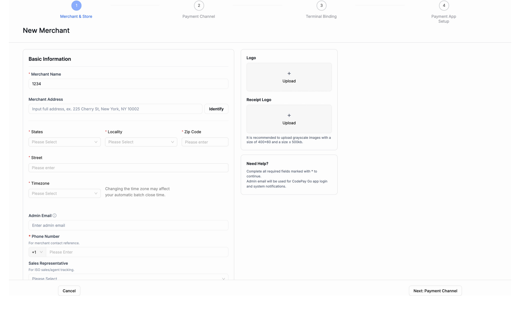
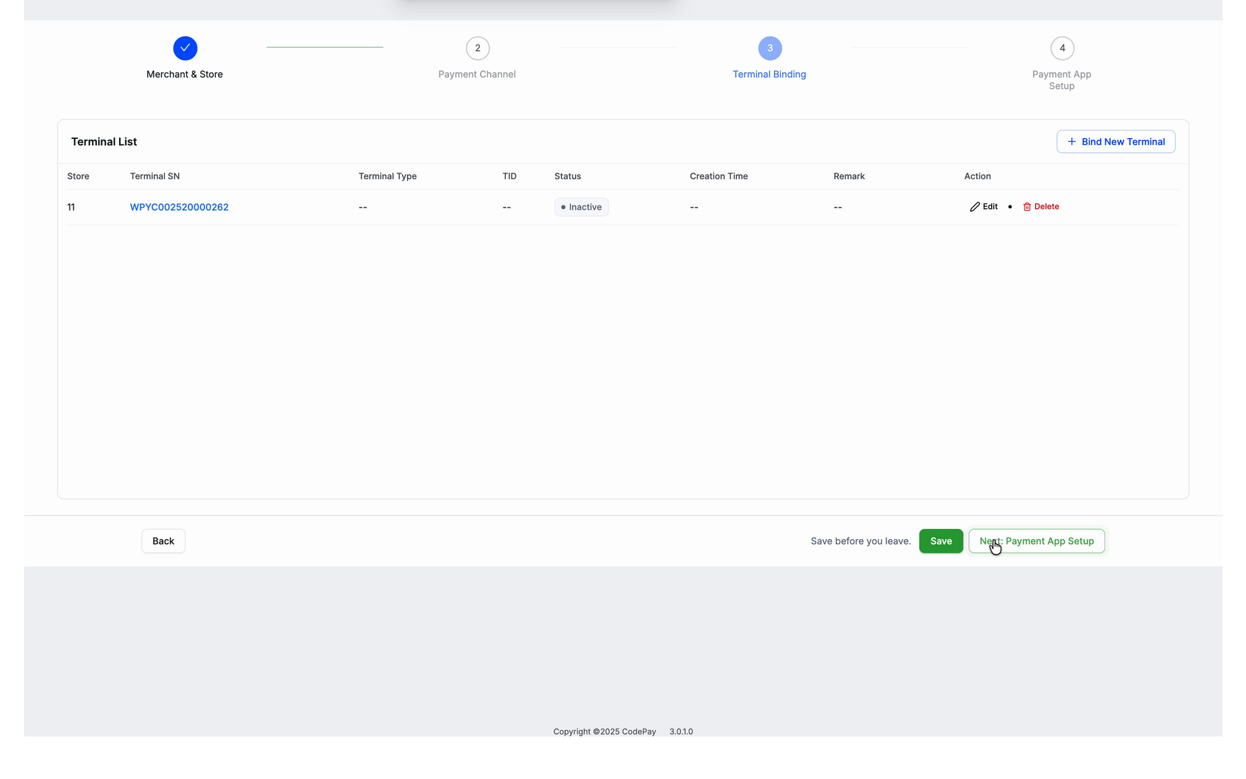
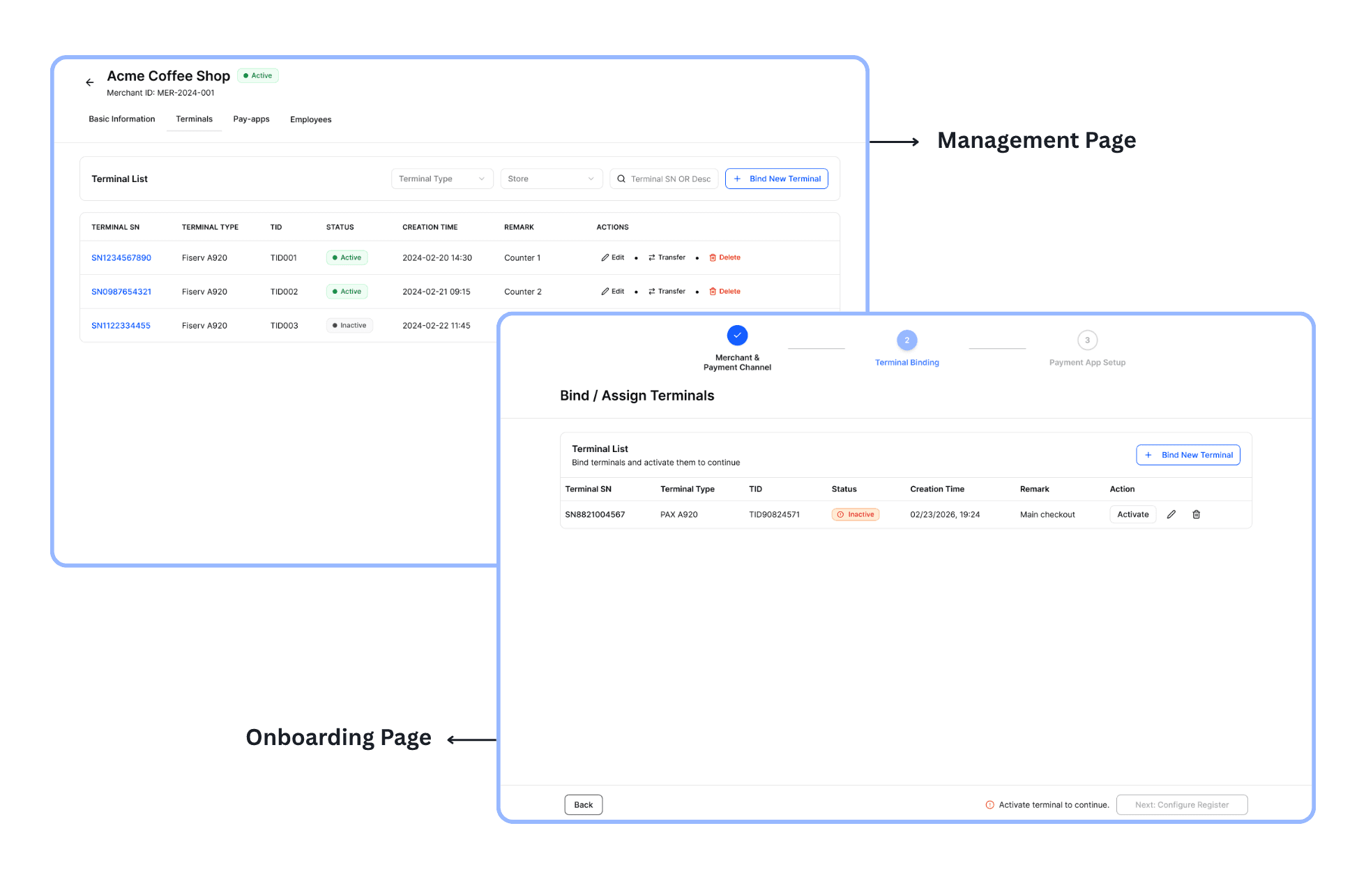
Onboarding, split from management
A first-timer no longer lands in the full management surface; the two became separate places.
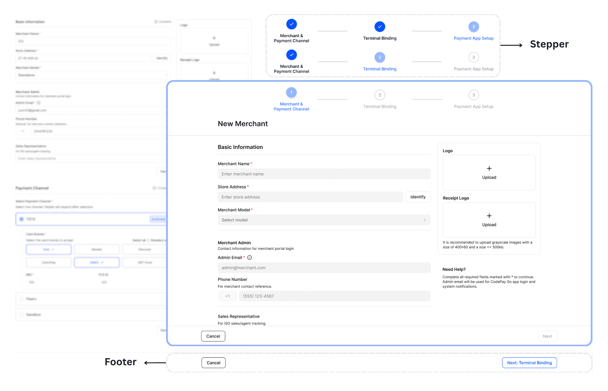
A guided stepper, required fields marked
Only what's needed to go live, in order, with required fields flagged as you fill them in.
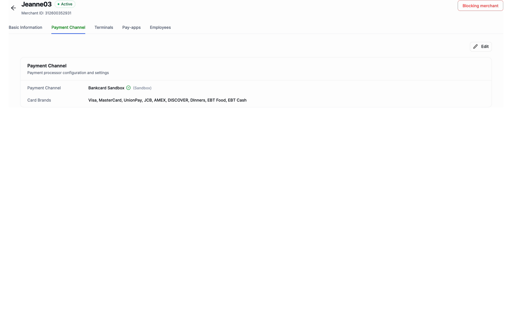
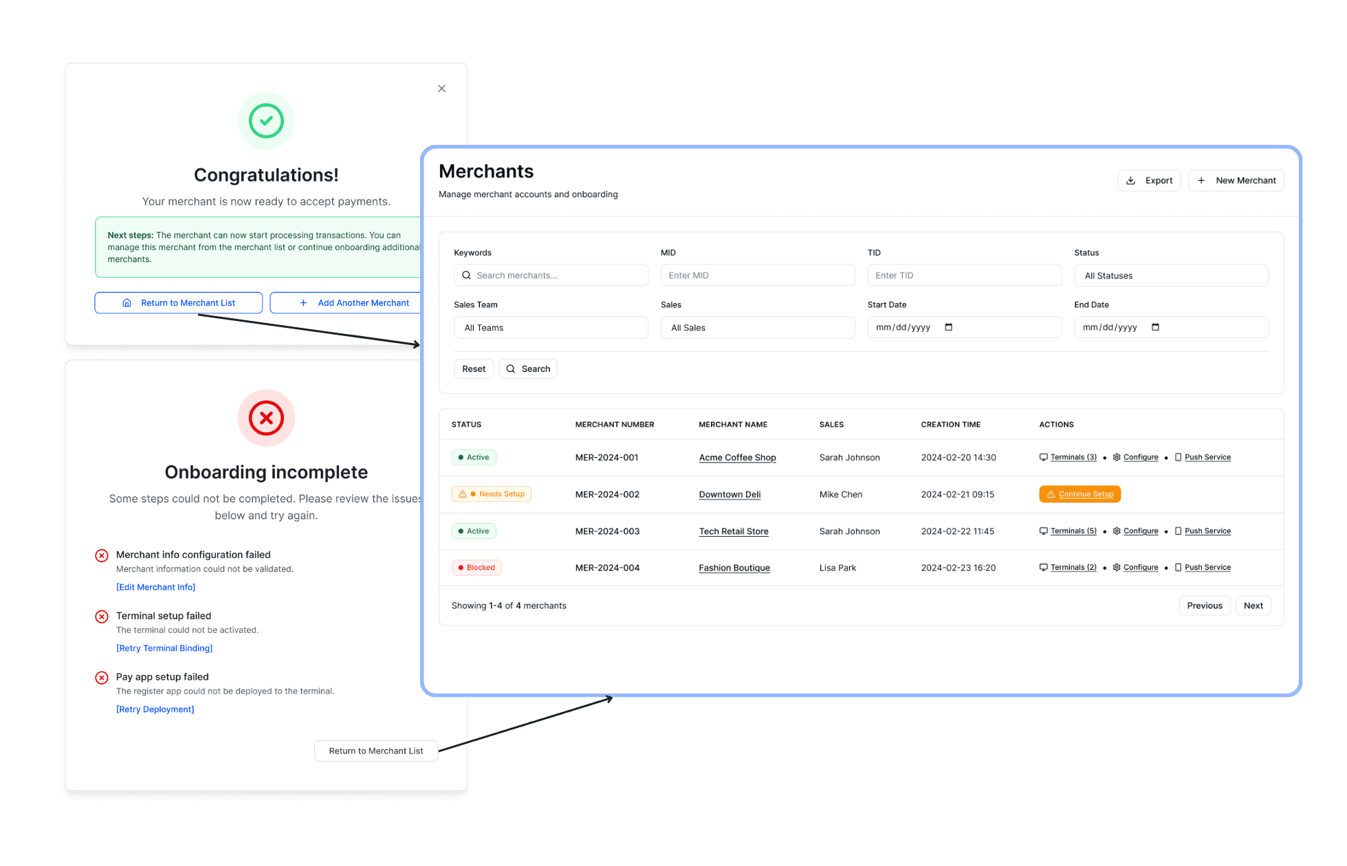
Explicit completion states
A clear done state, or exactly what is left, with the merchant list as the hub.
Built, shipped, and in use.
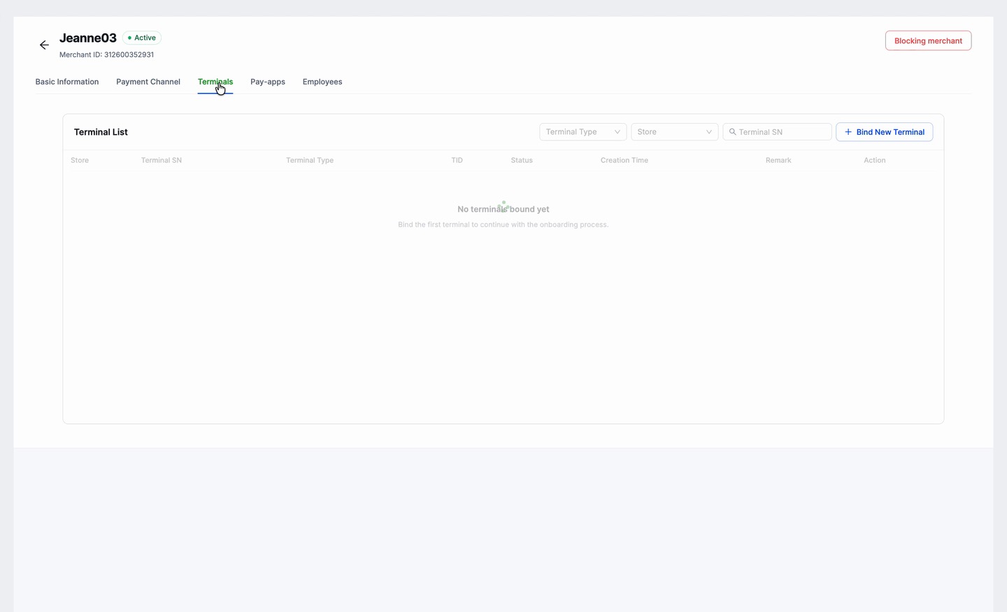
Two jobs, two places: onboarding to create a merchant, management once it is live. The merchant list ties them together.
30+
partners live on the new platform
~30%
less setup effort, internal test
Onboarding, just enough to go live
The guided stepper, end to end: merchant and store, payment channel, terminal, then the app on the terminal.
Management, the full surface
Once a merchant is live, the full configuration sits one place away: basic information, terminals, settings, and employees.
When one screen serves two intents, split the screen, not the user’s attention.
Takeaways
In high-risk payments, trust is the product.
Payments UX = trust & risk management
Data truth is a product surface
Dual-track delivery is a founding designer's real job
AI should be an acceleration layer for decision loops
Interactive AI prototypes
Vibe-coded to align stakeholders on value, risk controls, and the roadmap for external pitching.
Website & pitch assets
Standardized the messaging and cut the sales team’s “explain cost.”

